
Data Visualization with ChatGPT
Data visualization is a last-mile problem. Analysts craft amazing insights but often run out of time for beautiful visualizations. Unfortunately, this can blunt the impact of valuable insights.
But, as discussed in Data Analysts: Level Up with ChatGPT, modern AI tools unleash data visualization creativity and productivity. Using tools like ChatGPT, data analysts can quickly and effortlessly create beautiful, high-impact visuals for their analytics.
The steps are simple. You just:
- Prep your data
- Describe your data to ChatGPT
- Request your visualization script from ChatGPT
- Create your visualization in your Python, R or analytics automation environment
Let's walk through an example!
Prepping Data: US State Population Time-series
To start, you need to get your data ready for use. Locate your dataset and load it into your favorite Python, R or analytics automation environment.
For today's exercise, we'll use US State Population time-series data from 2013-2020. The raw data is formatted as a JSON blob, but you can use tools like Savant to easily convert this into a tabular format that's ready to use:

With our data in tabular form, it's easy for us to understand – we have a simple table with State, Year and Population, and we can confirm it ranges from 2013 to 2020. Now let's visualize it!
Describing Data: State, Year and Population
This step is pretty simple. Now that we've prepped our data, we just need to tell ChatGPT about the basics. In this case, we give it the name of our fields:
The fields are State, Year and Population
In more advanced scenarios, it could also be helpful to tell ChatGPT the data types for each field.
Requesting Viz Script: Map Population Growth
Usually, creating data visuals is tedious and time-consuming – bogging down data discovery, disrupting creativity flow and extending project timelines. But with ChatGPT, we can quickly produce and even iterate on data visualization without any of these issues.
Today, we'll ask to see State Population Growth from 2013 to 2020. To do this, we need to define a population growth metric for ChatGPT, and then request to plot it on a map of US states. (Note: In this example, we're using the Python library Plotly for visualization.)
Here's what this looks like:
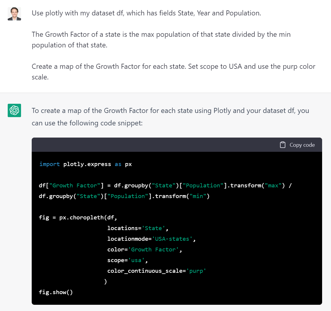
If you can read Python, you'll notice that ChatGPT has generated code to create a Growth Factor attribute and then plot it on a US map (using the purp color scale). And if you can't read Python, who cares! ChatGPT is taking care of the coding for us 😄
Creating Visualization: US Population Growth (2013-2022)
Now for the grand reveal! We can paste the visualization code that ChatGPT generated for us into our Python, R or analytics automation platform – and press go!

The result? A beautiful map that shows relative population growth across the US. Not bad for 10 minutes of work!
What visualizations have you made ChatGPT? We'd love to see them!
About the author
Lorem ipsum dolor sit amet, consectetur adipiscing elit. Suspendisse varius enim in eros elementum tristique. Duis cursus, mi quis viverra ornare, eros dolor interdum nulla, ut commodo diam libero vitae erat. Aenean faucibus nibh et justo cursus id rutrum lorem imperdiet. Nunc ut sem vitae risus tristique posuere.


